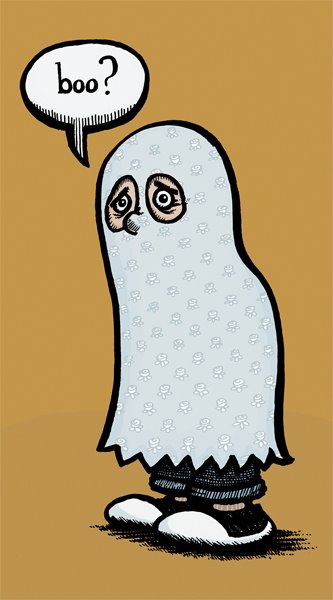
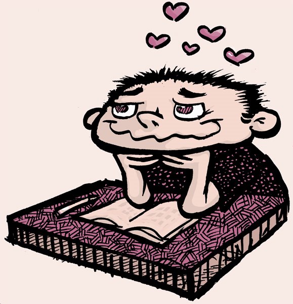
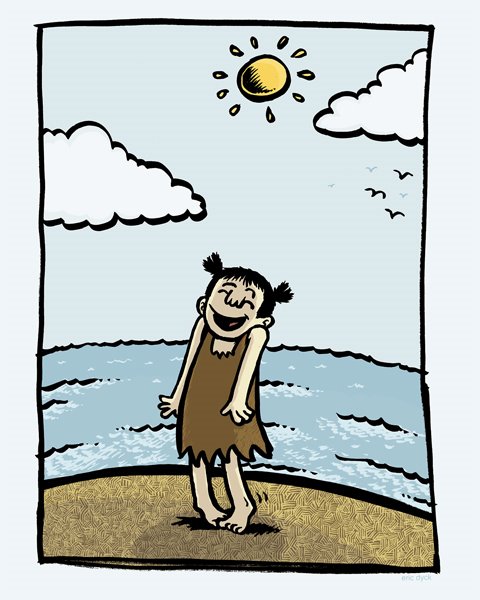
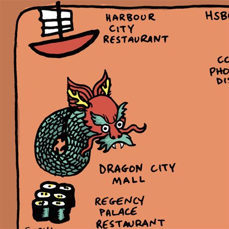
Sketches of upcoming projects and other brain noodling...


 These were sketched while listening to his tunes on his website.

 Once I'd settled on the pose, composition and likely lettering...the poster was drawn with Pitt brushpens (I wrecked 2 pens on this piece) and finework was done with my trusty Tradio. No worries about mistakes, I scan the inkwork, blemishes and all.
 I use photoshop to clean up the b/w file as a bitmap (no grayscale fuzziness...). I scan at 800 dpi, clean up in 800 dpi and compress to 300 dpi for colouring. Here is the cleaned up version. The date "flame", opening act and venue info were drawn separately and added to the initial file.
 As per Dave's tutorial, I create new layers and drop his signature colour blend (C:11 M:4 Y:40 K:1 ) into the entire picture. Using the Hue control, all of my colours more or less originate from this colour.
 I don't get too complicated at first. I make my way around the picture, selecting areas and creating a basic colour relationship.
 Re-selecting colour shapes and starting to manipulate hues.
 Using quickmasks of a shape (i.e. a finger or leg) to "deselect" portions with control...not unlinke relief printmaking. Once an artfully selection is ready, I'll adjust the hue again to create a shadow with a closely related colour.
 Using Dave's techniques, I then create a Color-Range-Select layer from the linework (follow his instructions carefully or you'll screw it up royally). I colour the lines the exact colour of the basic colour schemes...and adjust their hues accordingly. I was very hesitant to give up my black linework at first, but the results have made me very happy these days...
 The checker background was created by cutting/pasting 8 hand-drawn checkers, selecting them and using that selection to manipulate the hue of the yellow background...gotta love photoshop.

 Sketches from the book Teri gave me a few months ago...I'd had my eye on it for years now.


 ...and all the best in 2007, everyone!

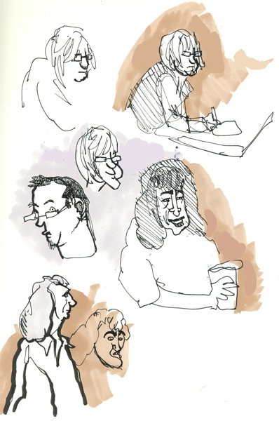
 A Basil Rathbone-as-Sherlock-Holmes film on TV the other night...lots of fedoras, trenchcoats, 40s haircuts and wonderfully English noses. There were a lot of cramped compositions (the entire film takes place aboard a train) which made for some great sketch opportunities.


 These are all sketches in preparation for a Science Matters illo...I realized after much work that spotted owls look nothing like my sketches, or even my favorite owl. Ah well...
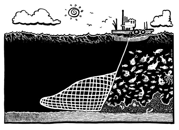 Illustration for an unpublished FFWD Weekly article, written by David Suzuki about Canada's lack of international reaction towards the destructive practice of bottom-trawling.